
Vector Annotations vs. Raster Graphics: Modern Mockup Architecture and Typography Principles
Introduction: Clarity as the Goal of Technical Communication
In software engineering and digital design, raw screenshots are shared daily. Yet straight system captures are frequently cluttered: busy desktop wallpapers, disproportionate windows, and lack of visual focus weaken reader comprehension.
Transforming mundane interface captures into Apple-keynote-tier showcase graphics is both an art and an engineering science rooted in vector node trees and physically calibrated mockup alignment.
1. Vector Precision vs. Raster Stamping
Legacy screenshot utilities stamp marks directly onto raw pixel buffers. This presents critical handicaps:
1. Irreversibility: Once stamped, drawn boxes or arrows cannot be independently selected, re-positioned, or resized.
2. Scaling Degradation: Exporting at 2x or 3x pixel densities causes rasterized stroke edges to blur and anti-alias into mush.
#### The Modern Node-Graph Alternative:
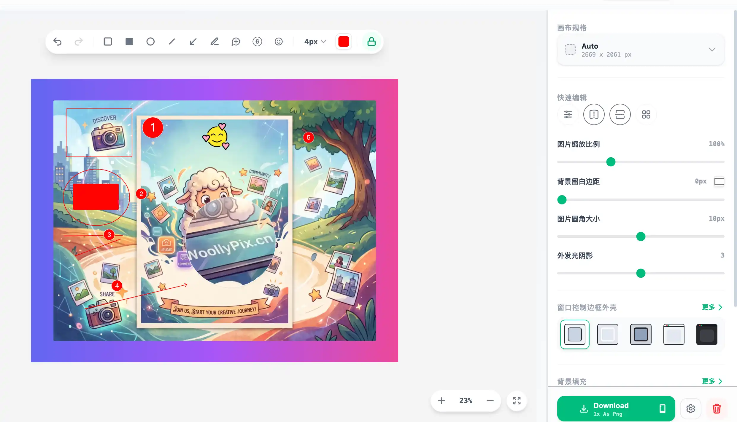
In Woolly Beautifier, the editor operates like a lightweight Figma:
* Background Raster Layer: Houses the user's raw interface capture.
* Vector Annotation Layer: Mockups, macOS traffic-light buttons, directional arrows, callout lenses, and step badges persist as mathematical geometric paths.
* The Benefit: Every shape can be clicked, dragged, or restyled interactively. During export, geometry is rasterized at the destination supersampled resolution for razor-sharp fidelity.
2. Device Mockup Geometry and Layered Shadows
Unrealistic mockups usually suffer from skewed aspect ratios:
* Physical Frame Ratios: A MacBook Pro 16 screen features a ~16:10 aspect, while an iPhone Pro approaches 19.5:9.
* Adaptive Aspect Fitting: The rendering engine calculates non-destructive bounding viewports, centering content without stretching pixel ratios.
* Ambient Occlusion Shadows: Modern depth relies on dual-layer drop shadows: a tight, darker contact shadow paired with a wide, ultra-diffused atmospheric glow (40px-60px radius at 10% opacity).
3. Annotation Best Practices for Technical Authors
* Numbered Step Badges: Guide reader eyes linearly using sequential step chips (1, 2, 3) rather than crowded text bubbles.
* Dynamic Contrast Rules: Deploy high-visibility neon greens or deep oranges over dark IDE themes, and crisp cobalts or crimson over light mode interfaces.
* Optical Magnification: Isolate minute UI controls or code lines using circular magnifying lenses with delicate border rings.
Summary
Polished presentation turns routine documentation into compelling visual narratives. With local-first vector beautifiers, creators can craft publication-ready interface graphics in thirty seconds flat.
This article was authored and verified by the WoollyPix Graphics & Frontend Engineering Team based on modern Web APIs and industry standards. All WoollyPix tools run 100% client-side with zero server storage.